Even with a beautiful background and attractive subjects, you cant pull it off without arranging all the elements correctly.
Its easier said than done. How to have the best composition in photography?
Composition entails multiple elements and principles. Once you know them all, figuring out how to make the best of them will be your next step, which is much more challenging.
Today, we will walk you through all steps to setting up a successful composition. You can also discover new ideas for your next shots. Lets dig into the details!
Table of Contents
What Is Composition In Photography?
Composition in photography refers to how you arrange an images components within the frame. This arrangement allows you to tell a narrative or send a message.
Your shot has a pattern, thanks to composition. It also affects how the image attracts your audience.
There are specifically defined principles that help you express your feeling or idea within the framework, even if there are no set rules you can apply when creating a photo.
Additionally, becoming familiar with these approaches might help you communicate your perspective through the photos.
Why is composition so important in photography?
Composition plays a vital role in photography because:
- A photographer will definitely strive for an appealing image by arranging the elements correctly.
- A picture is worth a thousand words. Even a simple picture can tell a story. If you carefully compose the shot, it will look even more engaging.
- Photographers each use a unique set of composition approaches. Use those methods to create stunning images that appear to be the work of a professional.
- Balance is a value that photographers want to achieve. To avoid distortion, make sure that the images components feel balanced.
- If you use particular photographic composition strategies in your own way, your images will stand out. Dont be shy to try out different shots and decide which ones have the best effect.
- The photos composition can give it a feeling of character. It will seem to be your own and can voice its traits.
- You can bring your photo to life using the proper picture composition.
What makes a good composition?
A solid composition is one in which each visual component has a defined objective and plays a role in the story.
There are numerous factors to consider when setting a composition, and each must be in the proper position, dimension, color, brightness, and shape.
Photography requires a balance between the components in the frame for an effective composition.
It means you must balance the number of details and empty space, lights and shadows, etc. However, there are also intangible ideas that demand balance.
The focal point and background are important in composition. The mood produced by the illumination and tone clarity might influence the weight of other parts.
The interactions an element has with the main subject in a movie determine how important the role is.
This idea is similar to how the weight of a visual component influences the weights of the others.
A leading line is only helpful concerning the things it prompts you to focus on. To accomplish this goal, you need a good composition.

Composition Concepts and Principles
To master the composition art in photography, you must learn the basics. There are several elements and principles to comprehend before taking your shot.
Elements of Composition
The six elements below make your photography. You will work with them to plan a proper composition.
- Lines
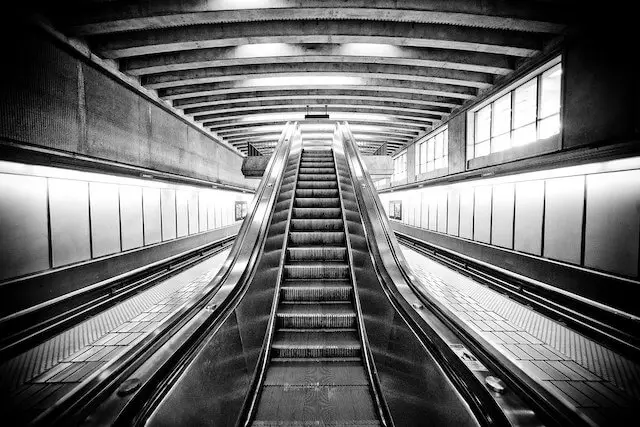
Lines are one of the most powerful ways to bring attention to particular frame sections. You should aim for a strong line that points directly at the subject to draw the audiences eyes.
Leading lines are those that direct your focus toward the subject and into the frame. You can have many lines that merge into the frame or towards the subject aside from the lines that flow into a composition.
Try to bring lines in from the edges wherever you can when sketching them. These lines do not cut into the frame like a harsh line from an edge would because the corners stay neutral.
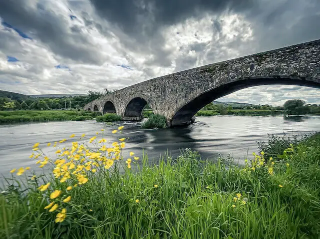
Besides, streams and rivers are excellent subjects for adding leading lines, motion, and color to your photo.
You can also use converging lines, such as those from buildings or any set of edges pointing inward from all frame edges.

- Shape and Form
Form and shape play a vital role in the design, but they are different from each other. Forms refer to three dimensions, including width, height, and depth.
A painting could have more shapes in it than a photo, which usually includes more forms because photography is a 3D portrayal of a scene.
The more attractive the form, the more appealing the photo. You can try geometric forms, like a building or a person.
- Value
Value in a photo indicates how dark or light something is. It involves shades of gray, black, and white.
Creating impressive photographs in black and white is one of photographys best attributes.
However, photographers often overlook how many tones to include in a single frame when searching for vivid colors or other striking elements in a subject.
- Space
Shapes and forms in your photo take up space in the frame. The way you arrange them is the composition, which also means space between or around the forms.
The forms and empty space are equally important when searching for a shot, especially in urban settings or with portrait art.
Remember that when applying silhouettes, forms might resemble shapes.
Playing with them to create objects that appear two-dimensional can also be a helpful compositional tool for photography.
- Color
Learning color is an integral part of learning photography. It consists of three elements: hue, intensity, and value.
- Hue: The name of the color.
- Intensity: How pure and bright the color is.
- Value: How dark and bright the color is.
Photographers, artists, and graphic designers must work with color schemes daily. Although they may sound simple, you need them for your compositions.
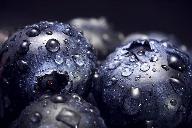
- Texture
The texture is about somethings tactile aspect. A photograph doesnt have a single tactile sensation. But, texture speaks to the impression of how something actually feels.
For example, if youre photographing a cactus, the roughness will give the viewer a feeling of how the cactus feels. Compositionally, emphasizing texture in a frame can help the viewer feel like they were there.

Principles of Composition
The elements are in your hands. A good photographer will find the best way to arrange them to establish a composition using some principles.
- Rhythm
Rhythm establishes movement by repeating shapes and forms throughout the frame of a photo randomly or in an organized manner.
- Balance
The way the two halves of a picture look together is a balance. It does not imply that the halves must be symmetrical.
Suppose one side of the photo has an object that draws the viewers attention.
In that case, the opposite side should include something to maintain your fascination with the entire composition rather than simply the dominant or bigger subject.
Unbalanced photos might keep the audiences attention to one side of the frame rather than letting it sweep over and through the entire frame.
- Proportion
Proportion is about the size of subjects in a frame in relation to one another.
Photographers may sometimes exaggerate the dimensions by adjusting the camera viewpoint within a good composition.
Additionally, you can organize the subjects so that the disparities in proportion act as the images central element.
- Emphasis
Emphasis is the process of directing the spectator to a chosen subject inside the frame using the pieces of your composition. The photographer can use many techniques to accomplish this.
Experimenting with specific lighting makes the subjects lit to stand out more. Proportion and leading lines are also valuable tools for emphasizing a subject.
Even the photographers choice of clothes or subject positioning might add interest to certain photo areas.
- Harmony
Harmony highlights the similarities between the subjects in an image by using color, line, texture, and other elements of art.
Harmonious photos often utilize a feature that all the subjects share to emphasize how different items relate to one another.
- Variety
The counterpart of harmony is variety. Variety contrasts various elements for their differences to add interest to the visual and convey the message.
- Movement
Movement is the photographers ability to portray motion within a frame.
Nothing in a still shot is moving, but you may give the illusion of motion by using shutter speeds, rotating, or zooming with your camera.
Gestalt Principles of Composition
The basis of Gestalt theory in photography is the concept that our brains tend to look for structures and patterns to break down and arrange a complicated photo composed of several elements.
Rather than viewing a picture as a group of unrelated elements, you might group some parts of it using Gestalt principles.
- Similarity
An effective compositional tool is demonstrating how things are similar. You can do it by combining things that have similarities in texture, shape, color, value, or size.
Bringing a lot of things together that have similar traits can help convey the pleasure that the viewer is seeking because they need a sense of harmony inside an image.
- Continuity
Continuity is the ability of the lines and shapes in your artwork to flow into one another. One shape may terminate and quickly transition into the next.
We like to refer to this principle as Flow. Essentially, continuity signifies how the elements of your composition move from one spot to another.
- Closure
In photography, it can be challenging to apply the concept of closure, yet the way to set up a composition can influence how the viewer perceives the image.
Imagine that you are taking pictures of a big group of people who dress similarly.
In the group, some people may not wear the same outfit, but you feel that they do at first glance.
- Proximity
Things seem to be a part of a larger group when you put them in your photo.
An illustration would be when you use a telephoto lens to take a picture of something.
By following this principle, you can compress the frame and bring the subjects closer in proximity.
For example, with some techniques, you will make two mountains look like they are in the same range, although they are hundreds of miles from each other.
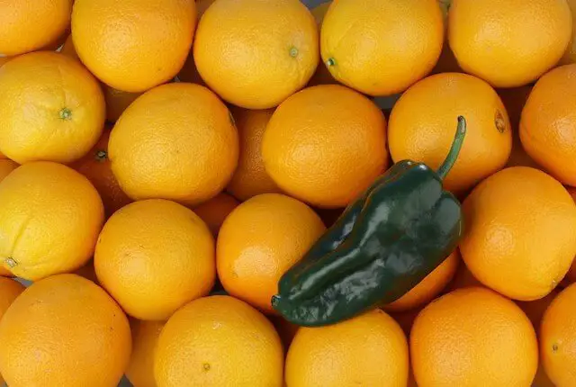
- Figure/Ground
The interaction between the main subject and other objects in the frame is Figure/Ground. Typically, they can be people, animals, or products.
Traditionally, the photographer strives to place these objects in a way that allows them to pop out from the backdrop and become the key aspect of a photograph.
In product and wildlife portrait photography, you can use bokeh or depth of field to separate the ground and the figure. Blurring the lines is also a good approach.
However, the approach in landscape photography is different. Most people need front-to-back clarity from the background to the foreground of a photo.
- Symmetry
Its crucial to make your sets lineup when they are symmetrically aligned. You can perform this task in the post-processing stage if its hard to do in the field.
Feel free to be creative when breaking symmetry so that the viewer can see that you intentionally did it.
And if the symmetry is off, it can give the impression that you have set up your composition lazily.
Photography Composition Rules and Techniques
Elements and principles are the foundation for every composition you make. We will give you some ideas to develop that foundation and achieve the best shot.
Simplification
Keeping things simple is the best approach for a clear and powerful composition.
Its about paying all your attention to one subject instead of overcrowding the frame.
You can utilize a shallow depth of field or remove unwanted components. They could detract attention from your main topic.
The more time viewers have to appreciate your photograph and grasp its meaning, the sooner they can recognize the central point of the artwork.
Filling the Frame
Filling the frame can strengthen the composition as you move closer to the subject. This method lets the focus land on your subject and details that viewers dont often readily notice.
Another benefit of this idea is that it will get rid of some distracting elements in the backdrop and give you fascinating abstract patterns.
This technique also involves cropping the picture in the post-processing stage.
Your photo will then appear to be a close-up shot. However, this idea has the risk of reducing the photos resolution.
Horizontal vs. Vertical
One of the first to make when taking any shot is to decide if you do it vertically or horizontally.
The cameras design encourages photographers to set it horizontally, but the subject will determine the orientation, not practicality.
Vertical objects typically belong in a vertical setup since a vertical format highlights verticals. In contrast, a horizontal frame is ideal for horizontal ones.
The ideal layout for landscapes is generally horizontal. Meanwhile, verticals are excellent for portraiture.
However, you may break the rule sometimes. Some photographers hold the camera horizontally when taking landscape photos, for instance.
But its not a specific rule, particularly if you want to manipulate the photos vibe.
Rule of Thirds
The idea for the rule of thirds is to break the scene into thirds, both horizontally and vertically. Your main subject should be at the grid points where those lines meet.
Experts recommend that the sky take up between one-third and two-thirds of a scene. Moreover, artists should avoid centering the horizon because it is less aesthetically attractive.
From then on, the rule developed and has since become a foundation of photography more widely, not only in landscape photography.
One of the primary rules of photographic composition, the rule prevents beginning photographers from positioning their subject in the center of the frame all the time. It also helps with a clearer understanding of producing a balanced frame.
This rule applies to more than merely placing subjects at their intersections; it also relates to gaining a basic understanding of balance.
The rule of thirds can be restricted. It might limit your ability to try more complicated compositional elements like leading lines, repeating patterns, and extensive use of the negative space.
Give it a try, just like with the other compositional guidelines on this list. Yet, dont assume that since something is famous, it will lead to successful work.
Framing
This form of compositional method, also known as sub-framing, requires using or including frame elements to highlight and draw the viewers attention to the subject. You can also use it just to stimulate interest in your photo.
Sub-framing can be natural frames, like natural rock formations, or artificial ones, like tunnels or windows.
It doesnt matter what form or shape it takes. As long as it highlights the chosen subject, your photo will undoubtedly be more visually stunning.

Color
Using color to generate beautiful shots and emphasize the meaning behind your photographs is another photography composition strategy.
You will have a great color composition by combining various, conflicting, or irrelevant components into a visually appealing arrangement.
Color affects the composition significantly because it changes how we feel about a photo. For example:
- Dark objects seem to advance, and light ones tend to recede.
- Warm colors advance, and the cool hues recede.
- Warm colors excite your mind, while the cool ones calm it.
You can use colors differently to boost your photos charm and direct the viewers eyes to your main subject. The following methods will help.
- Identify the accent color.
When compared to the other colors in the surrounding, an accent color glows up. Your photographs will have a more substantial effect since the chosen color establishes a strong focal point that captures everyones notice straight away.
Accent colors are not only bold colors, but artists prefer them since they are alluring and dynamic.
So if you are taking pictures, be on the lookout for neutral color settings with just one dominant hue.
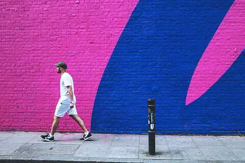
- Use a colorful backdrop
Consider how you might use a bright wall or any colorful background as the foreground of your photograph when you come across one.
Although the vibrant wall can make a fantastic photograph, the image will liven up if you add a person in the frame.
A person will give your shot more life and make your story more intriguing.
Once youve chosen a gorgeous backdrop, frame your image and wait for an exciting subject to enter the picture. Or, ask a friend to do you a favor and join the shot.
- Frame your subject with colors
We have mentioned the framing technique before. Now, you can use colors as a part of this approach to build a visual frame around your main subject.
For example, when you see two columns of colors, such as opposing walls, wait for your subject to walk in between. The walls are now the frames that any walking object can fit into nicely.
Another method is to look for vivid doorways or arches. Then, when a person walks through the way, you will have a stunning picture.
- Minimalist color composition
You dont stack multiple visual components in minimalist compositions. Instead, they demand bare essentials for the texture, shape, and color.
Search for colorful walls with a lot of free space to take amazing minimalist photographs. Make sure that any components, such as tree leaves, only take up a minor part of the overall image.
Take your picture without any other subjects in it if you want to highlight variations in the all that gather sunlight in a certain way.
- Use colors for the rule of thirds.
With this technique, one color block takes up one-third of the image, and another color block fills up the remaining two-thirds.
The rule of thirds is not at all restricted to color pictures. Yet, it is enjoyable and satisfying to actively seek out chunks of color that you can capture by arranging the colors following the rule of thirds.
- Combine blue and yellow
Yellow and blue are the two colors that blend in photographs the best. You will get the same effect with blue and another warm color, like orange.
This dynamic pairing can express both warmth and cold in a single frame. When combined with land and water, they may give the viewer a feeling of peace and calmness.

Contrast
Beginners may assume that contrast is about balancing between the dark and light in their photos.
Although this concept makes sense, a contrast in photography can be much more than what you can do with your shot.
For example, differences between slow and fast or small and big are forms of contrast. Some popular methods you can use in this regard include:
- Tonal contrast
The term tonal contrast describes the variation in hues or brightness among a pictures elements. It works on both colored and monochromatic photos.
Tonal contrast, for instance, can draw attention to a picture in color photography if you prefer keeping your composition basic.
Contrarily, black and white images use this approach to add depth to the pictures. As a result, you can exaggerate the contrast to obtain a strong effect.
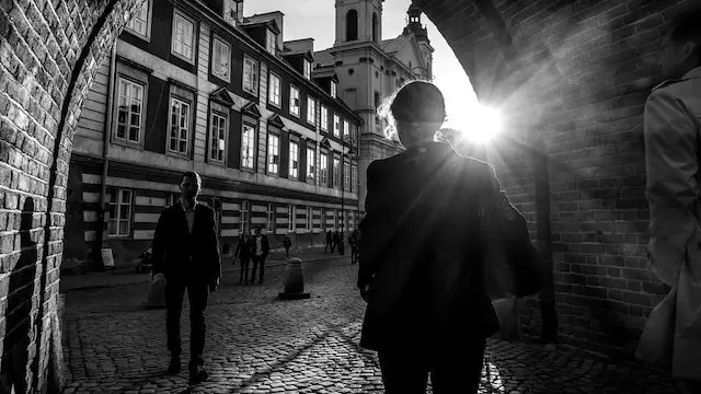
Tone ranges include high, medium, and low. The classic demonstration of tonal contrast is a silhouette. Photographers use it in modern cameras to drive the camera processors focus algorithms.
- High contrast
Dazzling whites, deep blacks, and a minimal, moderate tone make up a high-contrast photo.
Hence, these pictures may be the outcome of the interaction of strong hues or uneven textures.
This method might help your subject pop out from the background. For instance, photographing an object in direct sunlight will look darker than the surrounding.
Images with a lot of contrast might convey tension, energy, and power. As a result, photographers like to apply this idea to street and wildlife photography.
- Low contrast
Instead of using black and white, low-contrast photographs use mid-tone hues in different degrees of gray. These pictures dont stand out but have a dreamy effect with no shadows or highlights.
Low contrast is ideal for romantic landscapes, portraiture, and scenarios where you wish to add warm tones to your photographs.
Keep an eye out for mid-tones or colors with similar shades when photographing low-contrast pictures.
For instance, you can capture the vastness of the sky in contrast to the oceans blue hues.
- Texture contrast
If you want to integrate the principle of contrast into your photos, you may also add interest to how diverse a pictures textures are.
Employ the depth of field to soften the existing scene if there isnt a clear one. The separation between the subject and the backdrop will increase.
In this manner, you can display the textured picture while softening and blurring the background.
On the other hand, to make the subject stand out, add a soft accent into a rough background.
Then, you can combine the hard and soft components of the scene and integrate them into the finished artwork.
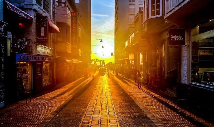
Leading Lines and Shapes
Lines and forms are two additional critical aspects of art that immediately grab our attention. Using leading lines to influence your audiences feelings about your picture will help you.
Lines are the ideal design element to help emphasize your intended focal areas because they have a solid inclination to guide the viewers eyes.
Hallways, staircases, bridges, and roads are excellent for showing leading lines.
They feature lines that shorten as they reach the far end, thus pointing to where your primary subjects might be.
Shapes are everywhere when you learn this photography composition skill, too. Houses and other building features typically use traditional, distinctly defined shapes.
Please also note that in every three-dimensional environment, you can also see compound forms if you look closely enough.
For example, diamonds and triangles often enhance the visual attractiveness of your pictures.
To identify and display those intriguing shapes, dont be shy to wander around and adjust the angle of your camera.

Symmetrical Balance
Symmetrical balance, also called formal balance, is one of the fundamental compositional principles for balance in photography.
This method requires you to position the main subject at the center of the frame. Then, both sides will appear symmetrical, looking like a mirror image, especially when there are vertical lines.
A symmetrically balanced shot in nature photography could show the reflection of a shrub, bird, or other things in the water. Some fully use negative space to make the main subject more appealing.
Professionals advise beginning photographers to avoid front-and-center shots and instead choose an off-center perspective.
However, in this case, a symmetrically balanced composition works flawlessly to emphasize the main subject aesthetically.
Asymmetrical Balance
In contrast to symmetrical photos, asymmetrical photos have uneven visual weight on one side. However, these visual elements counteract one another.
An asymmetrical photo still follows composition principles, so its not just a disorganized mess. Because of this concept, asymmetrical balance is hard to perceive.
You dont have to match everything on one side of the central point. Instead, work with negative space, subject placement, and line positioning to evoke a feeling of balance. This concept is all about the placement and weight of the objects.
You can place a big subject, such as a huge tree or a broad river, on one side of the picture to achieve an asymmetrical balance in nature photography. Next, add a lot of empty space to accent it.
Symmetrical balance is what many portrait photographers want to have. However, you dont always need to center the face of your photo.
In portrait photography, some compelling pictures feature the main subject slightly to the right or left of the frames center line.

Foreground Interest, Layering, and Depth
To give a picture depth, layering entails putting more components at various distances from the lens.
This method enables the viewers eye to be directed through the picture and to jump between multiple elements.
The impact becomes much more visually striking when your image has at least three dominating layers- foreground, center, and background.
Your subject may be in the front, middle, or background while using this approach, depending on where you put your attention.
If you work with fixed elements, a quick shift of perspective will change the size of the foreground. This change happens in relation to the backgrounds layers.
By integrating the foreground as smoothly as you can when editing, you can layer your images.
Just be careful to maintain the balance of the entire frame, and ensure the subject is something your audience can easily recognize.
As crucial as learning and using each compositional approach, you need to pay attention to your artistic instincts, which urge you to ignore all the guidelines.

Unusual Point of View
Kneel down, turn over, climb a ladder, or hang your camera from the ceiling.
Have you ever tried these methods when taking your shot? The unusual view will give unique yet impressive pictures.
If you love something like that, try these tips!
- Straight up
Although its easy to wander around with your camera without looking up, try it because you will have some spectacular compositional moments.
This method offers a worms-eye perspective of the world and works best when used with wide-angle lenses.
Spend some time finding the optimal angle. If you come across a nicely symmetrical image, put it in the center.
- Get low
Vari-angle and tilt-angle screens are the best for getting low with your camera.
But there are some things to pay attention to when planning the foreground and background:
- Foreground: Try to add some dramatic details in the foreground to give your picture more depth.
- Background: Conversely, avoid distraction in the background. Otherwise, your photo will become overwhelmed with too many details.
- Exaggerate features
A wide-angle lens does an excellent job of emphasizing your main subjects and the harmony they make.
Its a common solution to shoot architectural photos as straight and upright as possible. However, exaggerated features enhance your shot. After all, you will have a powerful and effective compositional tool.
- Twist
Shooting subjects straight on may be theoretically correct to keep the horizon level. However, the picture may lack drama and have a lot of negative space beneath and above the subject.
Why dont you twist your camera to add drama to your photo? It will form a striking diagonal line across the frame, immediately impacting the scene.

Golden Ratio
The Golden Ratio is roughly 1.618 to 1. For centuries, painters and photographers have used this proportion to create their works of art.
The Golden Ratio can work in photography in a variety of ways. The two most common compositions applying the rule are Fibonacci Spiral and Phi Grid.
- Fibonacci Spiral
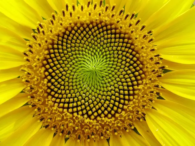
In the 12th century A.D., Leonardo Fibonacci, a mathematician, developed a set of numbers that would result in an aesthetic composition. The mathematician named it the Fibonacci Spiral.
Fibonacci created a group of squares with Fibonaccis numbers. The length of the square was a Fibonacci number, forming a spiral shape.
The spiral can then move through the frame by following a series of diagonal dots on each grid.
Photographers also use the spiral as a compositional element to guide the viewer smoothly through the image.
- Phi Grid
The Phi Grid and the Rule of Thirds principle appear to be extremely similar, yet there is a big difference between them.
The Golden Ratio divides the frame into pieces, giving a grid that is 1:0.618:1. Yet, the rule of thirds gives you equal thirds of 1:1:1.
When using the Phi Grid, you have a set of crossing lines that is significantly closer to the center of the frame.
Both versions of the Golden Ratio can work as a design principle when composing an image. Hence, there is no wrong or right way to do so.
For instance, the Fibonacci Spiral can be effective when shooting a portrait photograph.
However, the Phi Grid might be better for a landscape. The good thing is that these methods for photo composition are flexible and not particular to any one situation.
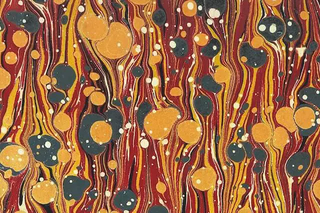
Patterns
Although patterns are always around us, we rarely think about taking pictures of them. Your brain quickly looks for and identifies patterns, making them an excellent compositional technique.
You can find patterns in artificial objects and nature. The key is spotting them and figuring out how to photograph them artistically or accurately.
Here are a few of the most prevalent patterns you might come across.
- Regular patterns
We call the pattern regular when we can predict the repeating objects.
They can be the same element repeated or when different elements change consistently.
You can find regular patterns in the building, where windows have repeating structures. The consistent effect makes the photo visually pleasing.
- Irregular patterns
Unlike the regular patterns, the irregular ones include unpredictable elements. They can be the waves in a pool or folds in a piece of paper.
When photographing pattern ideas at home, irregular patterns are excellent subjects because you can normally find something around you that works.
- Geometric patterns
As you can guess from the name, this pattern has geometric shapes. Those dramatic graphic elements repeat to add depth and texture to your photo.
- Organic patterns
Organic patterns have natural forms and shapes. They are beautiful organic textures that you can take from nature.
- Abstract patterns
You can try repeating similar shapes from abstract patterns without making a particular representation of any subject. The idea is to let viewers see the patterns, but they dont know what the patterns are.
Watch the Horizon
The horizon line usually appears in the center of the frame. Even though there might be nothing wrong with it, playing around with the placement of the horizon line in your photos will give them a more spectacular feel.
For example, in some cityscapes, when you lower the horizon line, you may capture the size of a skyscraper or the full extent of a mountainous view.
Dealing with the horizon line when taking a portrait photo can tell a different story by manipulating space.
Whether it casts your subject in a more thrilling or sorrowful light, this method can add a mood to it.

Zoom in (or out)
This method is different from just filling the whole frame. You must identify the most engaging elements of a scene and center your shot on those elements.
Sometimes, shrinking a scene and zooming in can yield compelling photographs by removing any distractions from the composition.
On the other hand, your lens may not allow you to include all the best elements of the picture in one single photo.
Expanding the photo and zooming out will give you the best image.

Reflections and Dynamic Foreground
Reflections not only generate a second image of the primary subject but also allow you to add more thrill to your photo because water will take any color.
If there is no water available, search for alternative dynamic foreground types.
Consider tree stumps, flowerbeds, attractive vegetation, or anything else that will fill the foreground in the frame and help you create an appeal to the entire image.
These foreground elements are common in landscape photography. Yet, they may also perform well in urban, portrait, and wedding photography with a little imagination.
Foregrounds dont need to be as vivid in portrait and product photography. Instead, they remove any distractions that direct the attention away from your shot.

Perspective
Perspective in photography is about understanding the spatial relationships between the things in the scene.
By shifting the cameras position and angle with creative compositions, perspective enables you to deliver a sense of depth and dimension.
Perspective creates depth. Hence, the best technique to demonstrate perspective is to employ a prominent foreground, middle-ground, and background in the composition.
Depending on what you want to take, you may employ a variety of perspectives. Here are five crucial techniques to apply to your images. You can use more than one in a shot.
- Linear perspective
Linear perspective means that you photograph lines to capture some vanishing points to give more depth to the image. A vanishing point shows up when lines meet in the distance.
Of course, the lines dont disappear. Its just an illusion. And when you can capture that illusion, it offers your viewers a new viewpoint and a more dynamic image.
- Forced perspective
With forced perspective, photographers make two or sometimes more objects look closer, farther, bigger, or smaller than they are in real life.
You must arrange the subject or item in the front on the same horizontal plane as the subject or object in the back to employ forced perspective in a photograph.
- Diminished scale perspective
You are framing your photo when you apply a diminished scale perspective. Then, as in actual situations, your objects get smaller the further away they are.
This method is excellent for giving your two-dimensional image a more three-dimensional impression and defining the scale in the scene.
You can frame your shot with a powerful foreground, mid-ground, and background for the best effect. Then, your photo will have more depth.
- Overlapping perspective
Including layers of objects that overlap one another is an excellent method to give them depth.
The viewers eyes can interpret objects in the front as being closer than those in the background, making objects in the foreground look bigger.
Overlapping objects can make an excellent compositional technique. It adds drama to the scene and helps you take a unique picture.
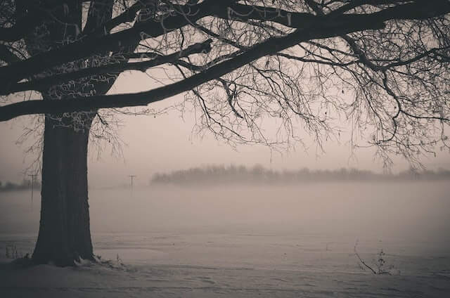
- Atmospheric perspective
A natural phenomenon known as atmospheric perspective occurs as light waves travel through the atmosphere, changing how we see things.
You have the best shot of atmospheric perspective on a foggy morning. It gives distant things a lighter appearance and more subdued hues.
If you can catch the contrast between a bright foreground and a blurry background, you can use fog or haze to increase the depth of your photograph.
Isolate the Subject
You can present your subject in a subframe or surround it with a lot of negative space to isolate it.
Alternately, use a very short depth of field to blur everything in the background.
Our eyes prefer distinct shapes. Thus, having a subject that is present clearly in your photo gives them more weight in the scene.
As a result of their isolation, our brain experiences a sensation of contentment, and our eyes can process their visuals more quickly.
Rule of Space
If an image portrays a moving object, such as a vehicle or an animal, there will be different energies.
Whether there is space presented in front of the subject for it to walk into or fall behind will depend on the situation.
You can try putting the object in a position that makes it look like it is heading toward the center of the image instead of attempting to escape. As the audience may predict where its heading, the experience can be more enjoyable.
The gaze of both people and animals can substantially affect the mood that a picture evokes.
Since it feels more natural, most television interviews place their subjects to one side and slightly slanted so they can gaze toward the pictures center.
The viewers attention will naturally go to the subjects or subjects eyes in a photo that employs this composition. They will then follow their attention to the images center to establish a sense of balance.
It might be unsettling, or the subject may appear faraway or mysterious if they look away from the frames center.

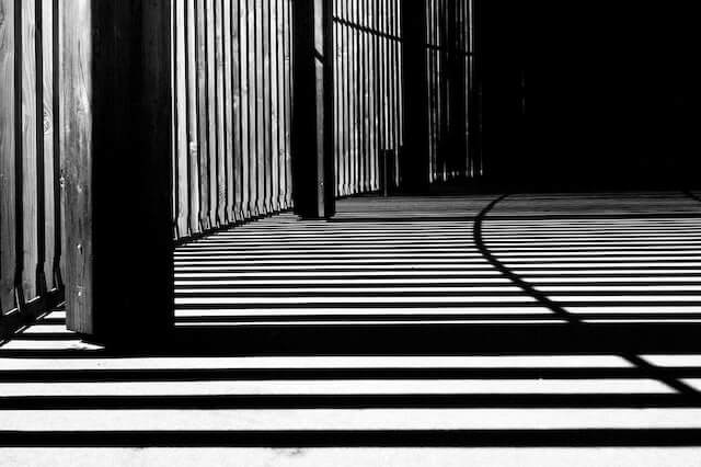
Lines
Lines have a significant influence on photography. You can convey a certain sense of movement using the correct line arrangement.
We have discussed how leading and horizontal lines work in your photos. They are the most popular methods for setting lines.
This section will highlight some ideas that can also help with your composition.
- Vertical lines
Vertical lines symbolize size and strength. For example, pillars and skyscrapers all give a sense of immense power.
You can significantly divide a shot using vertical lines in a horizontal photo. With a proper composition, this photo will have a powerful effect.
Dont forget the rule of thirds when working with strong lines. Unless you have a specific purpose, your photo will look unsettling when divided into half.
- Converging lines
In a photograph, lines that converge give a great impression of dimension and perspective. A picture of railroad tracks would be a typical example.
Use the rule of thirds once more, and set the point at the junction that best satisfies your shooting goals. Aim to keep those lines divergent ends from intersecting at the corners.
- Curved lines
Curved lines may imply motion, depth, and playfulness, but they can be difficult to use in composition.
For example, when you take a photo of the rainbow, it will lead directly to one corner of your shot. However, with sufficient attention, you can get the right composition.
Hogarths Line, often called the S-Curve of Beauty, is a brilliant example of the popular use of curves.
It gives the viewers an impression of perspective while keeping their eyes in the frame by starting at the bottom and working its way across the image.
Try to keep it from entering or leaving the screen at the corners, just like with other lines. You can do it easier with a slightly higher angle.
Common Mistakes In Composition
While learning how to master your compositional skills, dont forget mistakes that beginners may make.
Busy or sloppy edges
To provide some more room in case you need to change the post-processing, zoom out a little more when shooting wide.
Its not wrong to fill the frame with appealing subjects, but sometimes we fail to spot something in the edges that we need to remove.
To fix the areas while editing your photo, you might need to eliminate other significant portions of the photo if you dont have enough space to handle them.
The subject is not the focus of the frame.
Many beginner photographers are afraid of filling the frame with the main subject. But its still better than letting viewers keep wondering what you intend to shoot.
In other words, one of the biggest mistakes in the composition is forgetting what you need to focus on. You cant tell your story this way.
So, before shooting, consider the main subject and where you should point your camera to. Then, take a picture of it.

Uneven horizon lines
We have mentioned the benefit of the horizon line when taking landscape photographs. However, you can also yield a stunning effect if the line is even.
Make sure that your camera is perfectly level. If you notice its a little tilted in post-processing, try straightening it.
Unbalanced scenes
Balance is essential for composition. So if you dont achieve a balanced scene, you will waste all your effort in setting the scene.
Luckily, you can fix an unbalanced setup with some movements. If the adjustment doesnt work, zoom in or out with the lens.
Too busy scene
Your photo will look chaotic if you stack many things in the frame.
You can take your photo with a different depth of field or try a bokeh for the backdrop. Also, focus on the main subject and blur the rest of the background.
Improper depth of field
You might have a depth of field problem if all the areas in your photo arent sharp while they should be. Youll need to increase your aperture to solve this slightly.
For a shallower depth of field, you may need to snap at f/16 or higher. In certain cases, focus stack your photos and then mix them in Photoshop.
Furthermore, ensure that you are focusing on the proper frame area. Focusing a third of the way into the screen will produce better results for subjects requiring a large depth of field. Other apps can guide you in selecting your point of focus to have the correct depth of field.
On the other hand, consider reducing the aperture for a softer backdrop if your picture has too many sharp features that detract from the intensity of the subject.
The subject is too centered.
Just because your subject is in the center of your composition doesnt imply it can work. Putting the subject in the center isnt always the best solution.
Instead, try the rule of thirds overlays that most cameras have integrated into their view screen to place the object in the upper left or right quadrant.
Now you can set the focal points of the subject on those intersections.
Foreground is boring
A composition can either succeed or fail depending on the strong foreground.
Instead of rushing about late at night when the illumination is perfect, try arriving on location earlier to seek the objects that will create your fascinating foregrounds.
How can you improve the foreground? Its when your creativity comes into play. Try adding some props to play with it.
Remember that not every picture needs a foreground. You can also simplify the composition and get rid of the foreground entirely if its what your subject needs.
Best Composition Rules In Specific Circumstances
All the rules and principles above can work for many photography genres.
However, each genre has particular characters, so you may need different tools to make the best of your shot.
Here are the seven most popular circumstances in photography. We will recommend the best composition rules for each.
Food
Taking a photo of food, you have to show viewers how delicious they are. The following tips will help you get that effect:
- Use one item as the main subject
You often need to focus on one object only in food photography. The central point should be in the center of the frame and dictate the props to create depth.
You can arrange the focal points using isolation, color, light, and contrast techniques. Including two or three objects in the photo will be fine. Yet, one must be dominant.
- Achieve a balanced setup with negative space
The negative space is where viewers can rest their eyes. It gives balance and emphasis to the main subject.
In food photography, the picture has a lot of empty room to add texts. You can also use the negative space for the patterns that complement the subject.
- Rule of odds
Odd numbers establish a sense of harmony and balance. It also gives a resting point for your eyes.
For example, you should aim for odd numbers when setting up the objects. Three or five glasses of cocktails look more attractive than two or four of them.
- Phi Grid rule
You can apply the rule of thirds or Phi Grid rule in food photography. The rules help you set up your objects harmoniously, making a balanced picture.

Architecture
Architecture is more complicated than food because its bigger and has more features. Learn how to master it with these tips.
- Use leading lines
Leading lines will direct the viewers attention toward the structure immediately. This tip can avoid the common problem of boring architectural images.
The leading lines dont have to converge perfectly on the subject. Instead, use something to lead peoples eyes in a particular direction.
- Focus on the details
Its OK to focus on the whole building when photographing architecture. However, tiny details look more appealing.
You can start to shoot the building from the outside. Then, move to specific details, like the door or the lights. Then, you will have more options when editing the final products.
- Add reflections
Find some reflections in the frame. It will add a sense of contrast and symmetry to your photo.
For example, many buildings these days have glass windows. Why dont you capture the sky reflected in those windows?
- Experiment with different angles
In architecture, your perspective is the most impactful element. A different view will change the whole composition.
Hence, try shooting straight, above, and below the subject. Tilting your camera to exaggerate objects will also be a great idea.

Street
Composing a picture for street photography is pretty intimidating because you have many objects to shoot. Dont worry; these techniques will save your day.
- Depth of field
There is no fixed range for the depth of field. Depending on your cameras parameters, its size changes. You may need a modest or deep field after considering your subject.
A landscape shot should typically have a deep depth of field or be consistently sharp. Meanwhile, a shallower field can highlight a specific aspect of an image or enhance the sense of depth.
- Texture
There are many opportunities to capture subjects with texture when doing street photography. Peeling paint and worn boards are a couple of examples.
Investigate your citys composition while focusing on striking colors or patterns.
Your eye will develop a habit of looking for these potential textures once you start doing so.
Travel
Lets discuss some compositional photography strategies to help you take better travel photos.
- Symmetry
To use symmetry without making the image seem stagnant, center the symmetrical axis in one direction only-not both.
If the axis of symmetry of your photo is a reflection, for instance, positioning it off-center gives the eye some guidance by distributing the visual weight.
- Framing
Features like windows and arches make the best frame. Generally, youll want to take shots straight on, but if shooting at an angle will catch the best view, go for it!

Fashion
Fashion photography has become more and more popular these days. Here are some tips for taking a beautiful fashion shot.
- Create a counterbalance
To achieve balance in your photo, use counterbalance by including another element in the frame.
For example, the composition would appear asymmetrical if the model sat on the cart alone. Your photo will look balanced if you add a second model pushing the first one from behind.
- Add props
Props might help you build a deeper theme for your fashion photos.
They not only do an excellent job of providing your photographs with context cues, but they also give your composition more texture.
- Let the model interact with the environment.
Your picture wont be dynamic if the model just stands around. Why dont you have them act around the space?
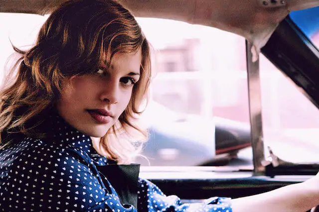
It isnt only about making poses. For example, you can ask your model to sit in a car and pretend to be driving it.
Astrophotography
Astrophotography is the practice of taking pictures of the moon, planets, or far-off galaxies. How can you handle such a technical photograph?
- Rotate the image
With this approach, dust lanes give the photo a three-dimensional appearance. The galaxy has a lot more charm.
In astrophotography, there are no clear up, down, left, or right directions. You can always rotate and flip your picture to try and get your mind to perceive more.
- Tight composition on large subjects
If you are shooting at one target, it should be larger and have many different colors and textures. A tiny twinkle in the shadows lacks interest, and your project will fail.

Still Life
Many beginner photographers start with still life photography. However, this category isnt simple to master. Here are some tips for pulling it off.
- Color
A complementary color palette is among the most effective compositional tools. One such combination that often appears in still-life photography is blue and yellow.
Consider the color of the background or the material you are photographing. Bright colors can take attention away from your subject.
Therefore, be sure that your background portrays the mood and blends in well with the materials you have picked.
- Focus on the hero subject
The impression of total chaos results from confusion over which object is the hero. The viewer cant focus on one object because they are unsure about where to look.
It does not imply that the focal point of your photo must be your main subject. But you should draw attention to it by doing so.
So try to bring more light directed to the main subject. You can also use objects, like spoons, to point at it.

Frequently Asked Questions
1. What can I do to improve my composition?
Mastering composition in photography is a long journey. On this path, you can improve your skills with these tips:
- Use your camera properly. It comes with many features that can bring powerful effects to your images.
- Try to look beyond the obvious. Your first viewpoint is not always the best one.
- Train your eyes by taking many pictures and learn from the compositional techniques you have tried.
- Find other photographers artwork to see how they play with compositions.
- Keep working with symmetry and geometry.
- Use gestures and punctuation. Your photos may need something more to lift them higher than the ordinary.
2. How do I know if I’m a good photographer?
You can be confident about your photographic skill if you have eight signs as follows:
- Even when you dont have all the kits with you, you will be happy to capture the image with your phone.
- You can check the frames edges before pressing the shutter.
- You always have your pictures backed up in two different places, with one being offsite.
- You are aware of what dust can do to your pictures.
- When it comes to contrasting and comparing, you have achieved inner harmony.
- You are constantly working on a personal project.
- You know that light makes your shot.
- You are so clear about every digital photograph needing a post-processing stage.
3. What are the basic compositions of photography?
There are many rules for setting up the frame for a picture, but the most basic composition includes:
- Rule of thirds
- Balancing elements
- Leading lines
- Symmetry
- Viewpoint
- Background
- Depth
- Framing
- Cropping
- Experimentation
4. Can I break the rules of composition?
If done effectively, breaking compositional photography rules can create outstanding outcomes.
The rules regulating photography and visual composition are not particularly strict. However, if you choose this way, please remember that:
- Before breaking the rules, learn them and understand how they work.
- Avoid breaking every rule at once.
- Make sure you have control over the viewers eye movement.
- Keep the rule-bending until the editing stage whenever you can.
5. Is the rule of thirds the most important composition rule in photography?
No, but its the most basic and standard rule in photography. It helps photographers balance the main subject with negative space in a shot.
This way, they can nail an effective and eye-catching photography composition.
6. What should I learn first in photography?
As a beginner, you need to learn many things. To progress quickly and successfully, take these steps:
- Learn how to use the camera like the back of your hand
- Take the first shots with manual mode
- Learn the three pillars of exposure
- Try with different genres
- Learn from others work
- Develop your editing skills
- Be more conscious of light
- Master all the equipment you have
- Focus on the composition
- Take a photo of everything that you love
Conclusion
Mastering composition in photography is an arduous and long path. However, once youve nailed it, your viewers cant take their eyes off your photos.
We have mentioned many rules, principles, and ideas for setting a composition.
Do not be shy to experiment with all of them. Also, a good photographer must be creative, so dont mind breaking the rule when necessary.
Hopefully, you will find this article helpful. If you know any methods that improve composition in photography, please share them with us.
Thank you for reading!